When I started life as a printmaker I would probably thought that hand colouring or tinting an image was cheating. If it wasn’t printed, it wasn’t a real print. Now that I am much closer to my demise, I am a bit more relaxed about things like this. I’ve grown to accept a bit of variation or individual character within my ‘identical’ prints. And to realise that hand tinting is a skill in its own right, which has a long history involving both printmaking and photography. It gives a unique look and is an ideal technique to try during a lockdown. Every pandemic has a silver lining.
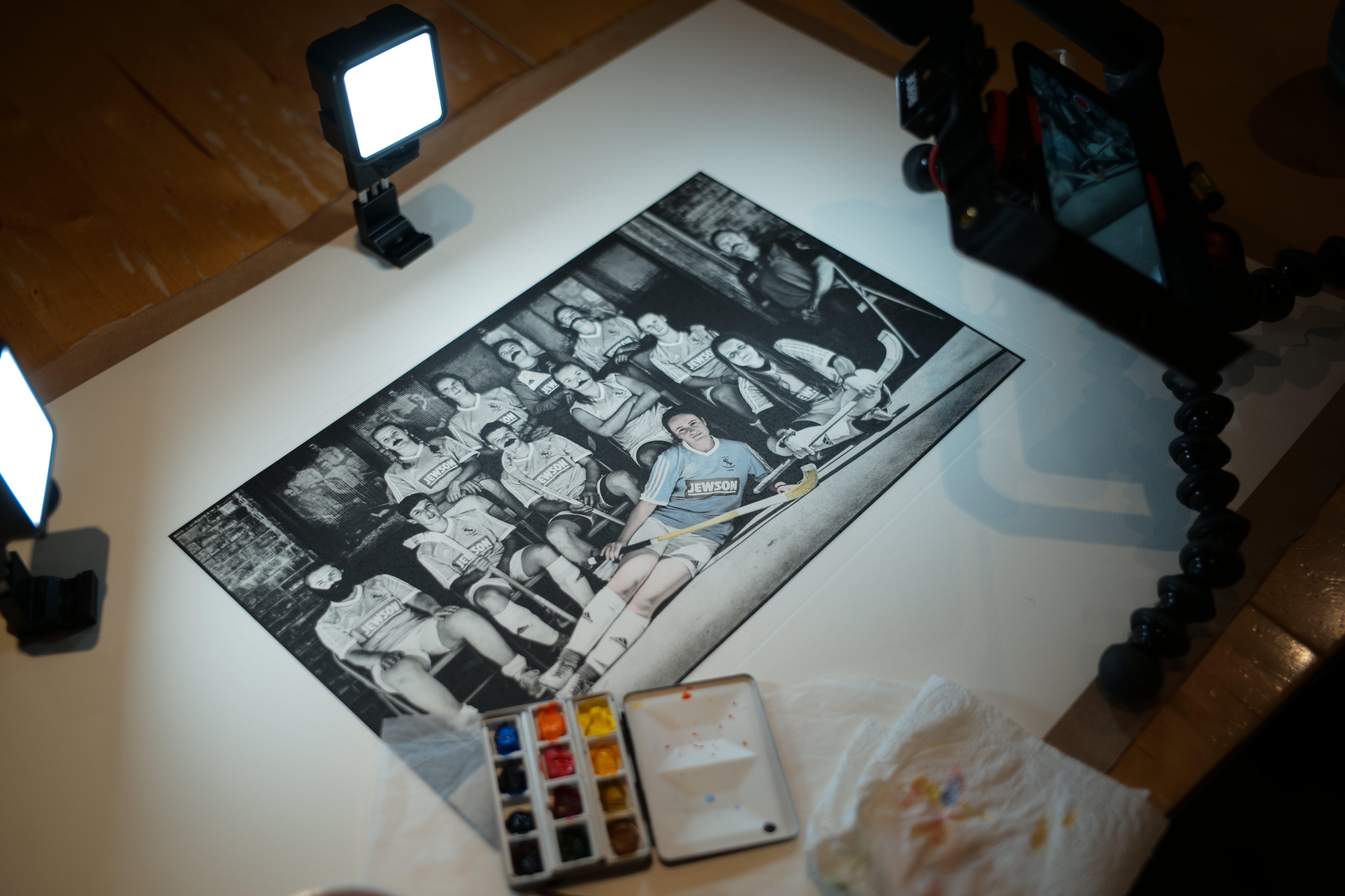
I’ve been using it over the past few years to apply colour to photogravure prints. Sure, there are ways to print colour on these prints – just before this lockdown, studio user Ian Gibson was trying 4 plate CMYK photogravure. It was starting to look great, but with a totally different feel to hand colouring. As with a lot of things, we can get caught up in arguing which is best – the reality is they are both different. It’s all about preference.
There is no getting away from the struggle that has gone on to achieve excellent colour in photographic images, a struggle that continues into today’s digital age. Like virtually every invention in the history of humanity, Scotland has a good claim to have produced the first colour photo with the physicist James Clerk Maxwell demonstrating a three lantern slide in 1861. Before this, the only way to achieve colour in photography was to apply it by hand, the earliest examples being credited to the Swiss painter and printmaker Johann Baptist Isenring, who applied pigments in gum arabic to daguerreotypes around 1840. The photographic methods which came after Maxwell remained difficult or clumsy enough to ensure that hand tinting remained popular until the mid 20th century.
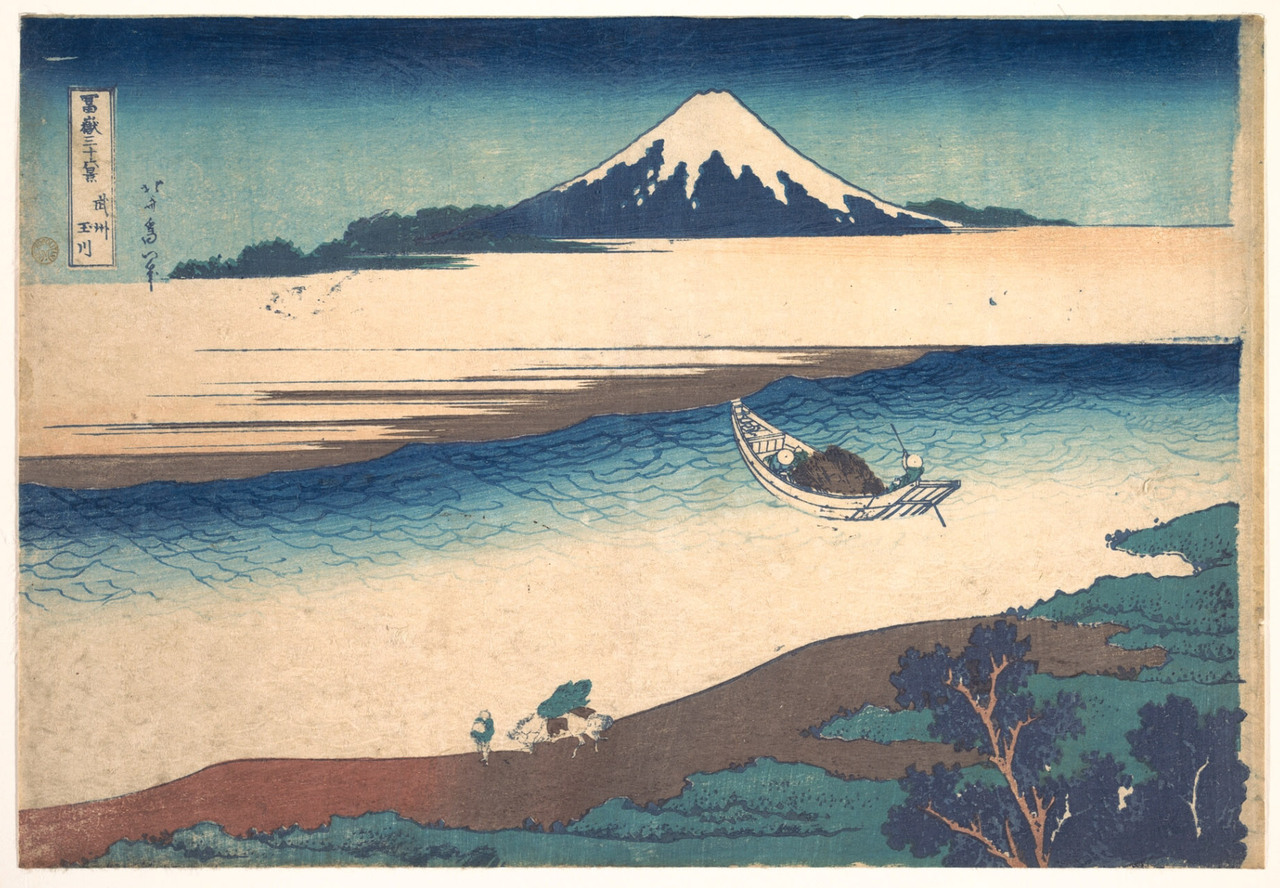
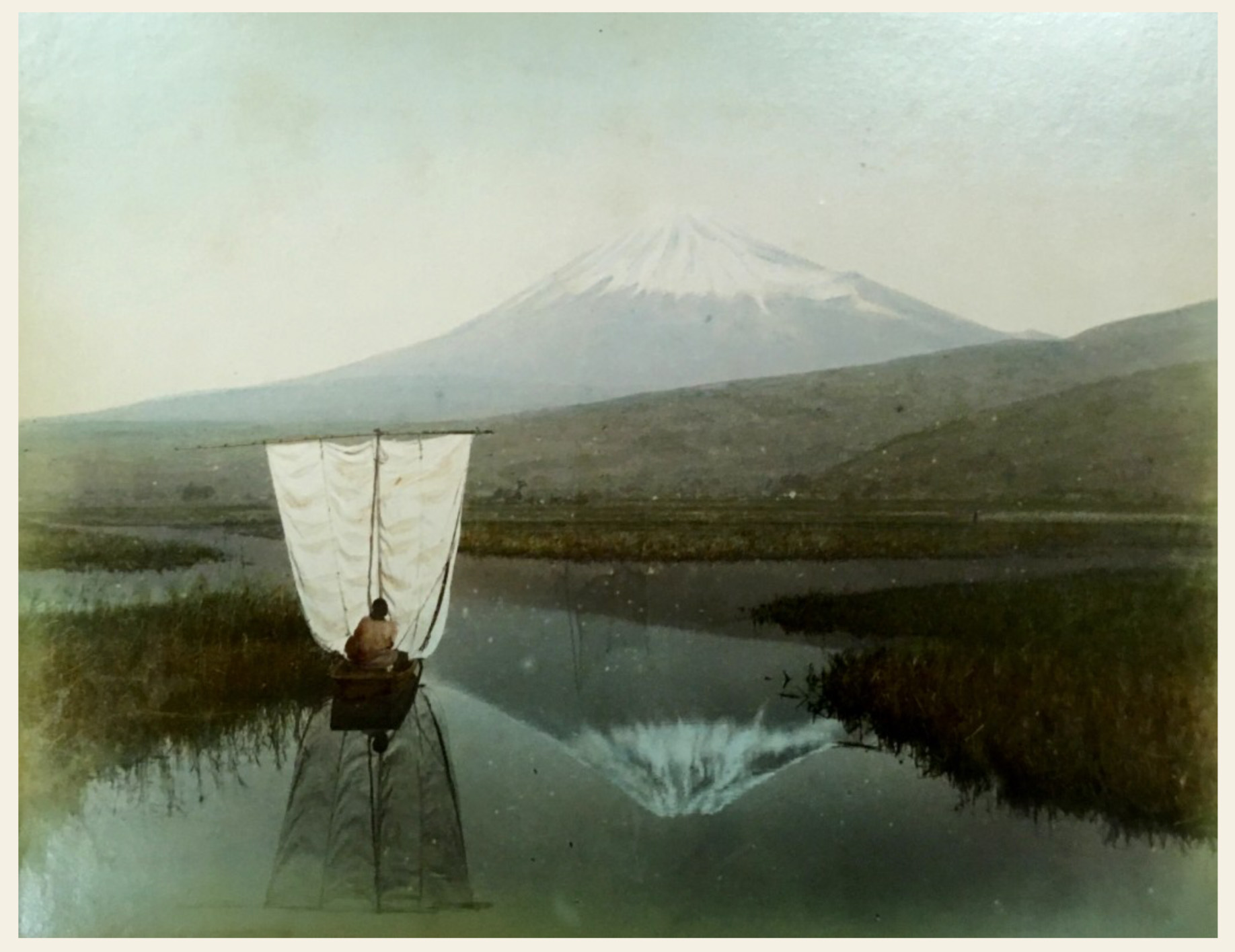
Hokusa woodcut of Mount Fuji shows ukiyo-e prints influence over Japanese hand coloured photography
Japan is where hand colouring flourished. There were several reasons for this. The Meiji Restoration in 1866 started to transform Japan from a closed feudal society in to a modern, high tech, industrial country. Crucially the borders were opened to allow foreign visitors. The second factor would be the advent of photography and its arrival in Japan, and a third reason was the subsequent decline of the famous ukiyo-e woodblock printmaking. Several European photographers such as the Italian Adolfo Farsari, settled in Japan and set about providing photographic keepsakes for visiting tourists. These images concentrated on the traditional idea of Japanese culture, not on the modern changes taking place. A bit like ignoring the Longman and selling shortbread tins and tartan dolls in wee cellophane tubes. A lot of the landscape images were similar to ukiyo-e prints, but this was not the only link. The woodblock printing industry had relied on highly skilled colourists who would apply water based pigments to the prints by brush. As the printmaking work diminished, they were utilised by photographers, and their remarkable skill elevated hand tinted images to new heights. A great example of printmaking skills influencing photography.
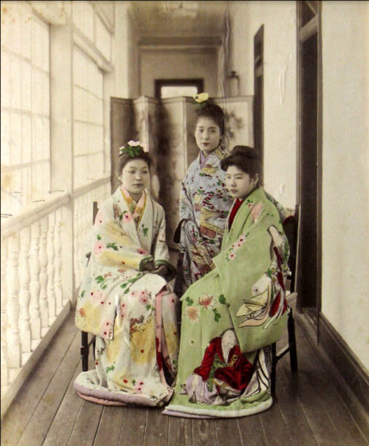
As these photos were brought to Europe and the US, they influenced colourists in the west. Here the technique developed using dyes and oils, which tended to give a brighter colour and could lack the subtlety of the Japanese watercolour pigments.
Obviously hand colouring is time consuming, so when Kodak made colour film popular, hand tinting became more niche, but it has survived through the last century and in this current one.
Hand coloured photos from an unlikely location are now commanding high prices amongst collectors. Whites Aviation produced a series of large scale views of New Zealand in the mid 20th century. Leo White, the founder combined his interests of flying and photography and managed to define the stereotypical idea of the NZ landscape. In his small company building in Auckland, he employed ‘the colouring girls’. Eight women who skilfully hand coloured his expansive monochrome photos. They loved the work, most of them being there for 30 years or more. They formed a remarkable friendship, even going on holidays together. It brings to mind the social side of Highland Print Studio, although maybe we could stop short of holidaying together…
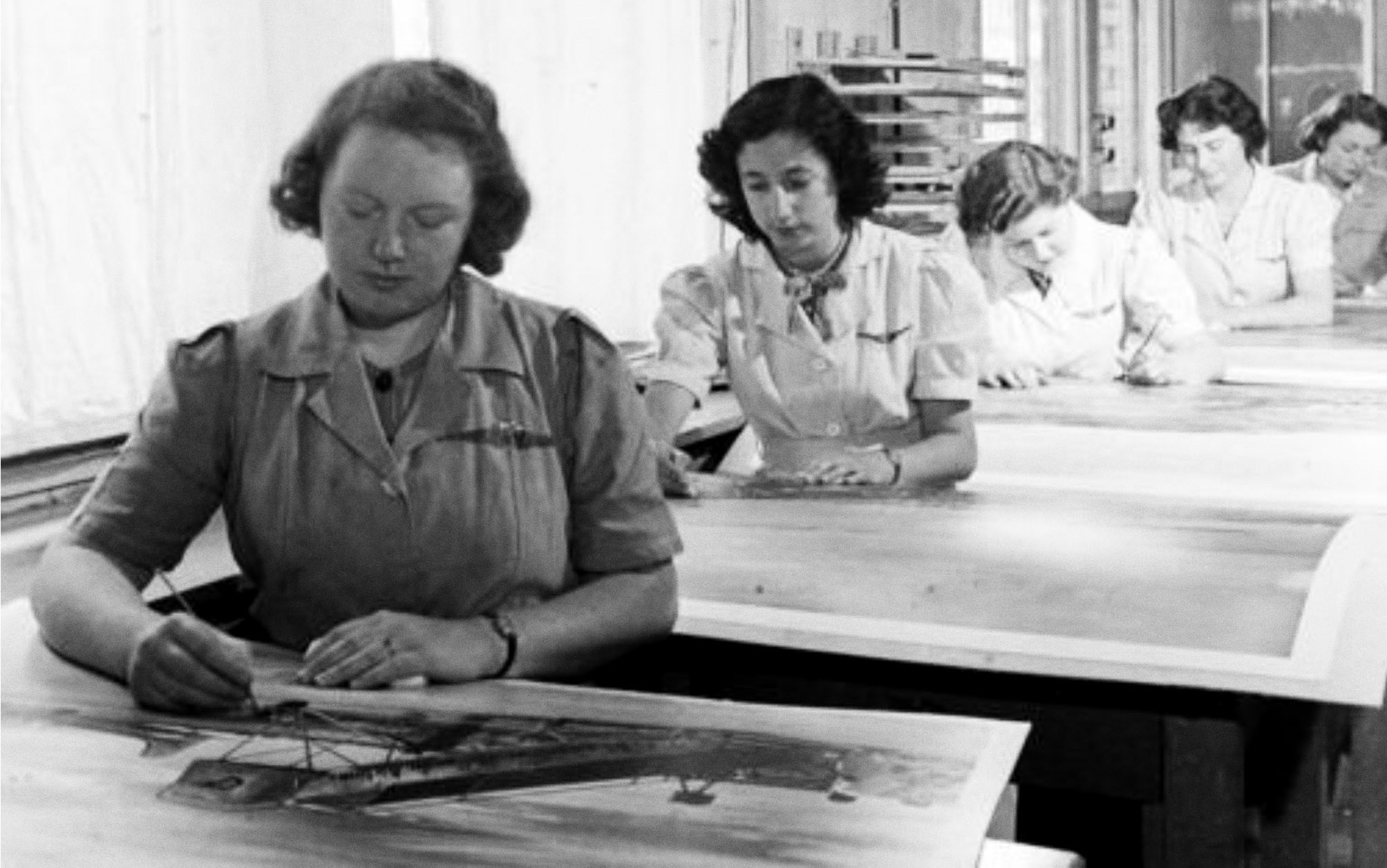
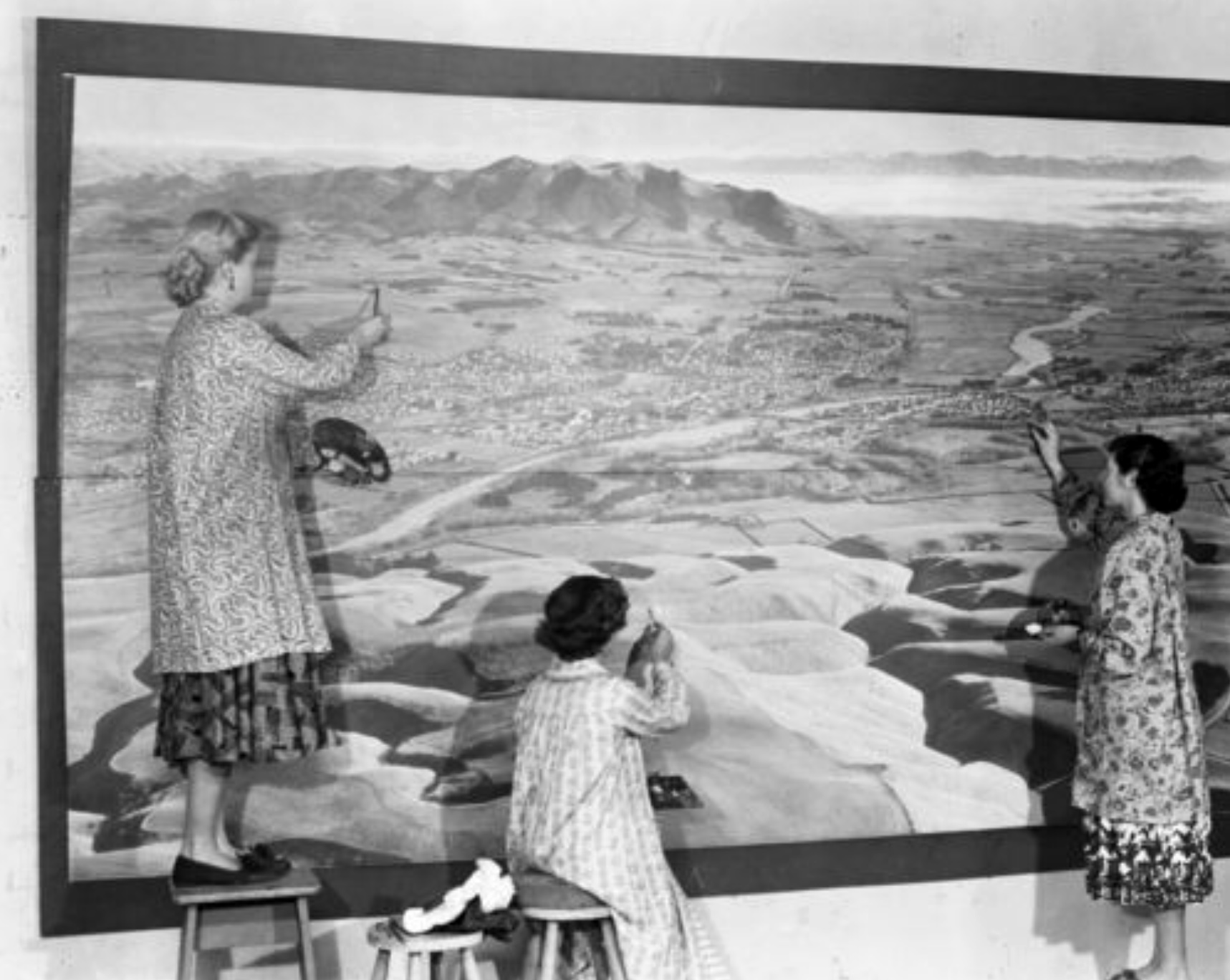
Whites colouring girls in action. Grace Rawson working on the left of the large photographic mural produced for a large Aukland store.
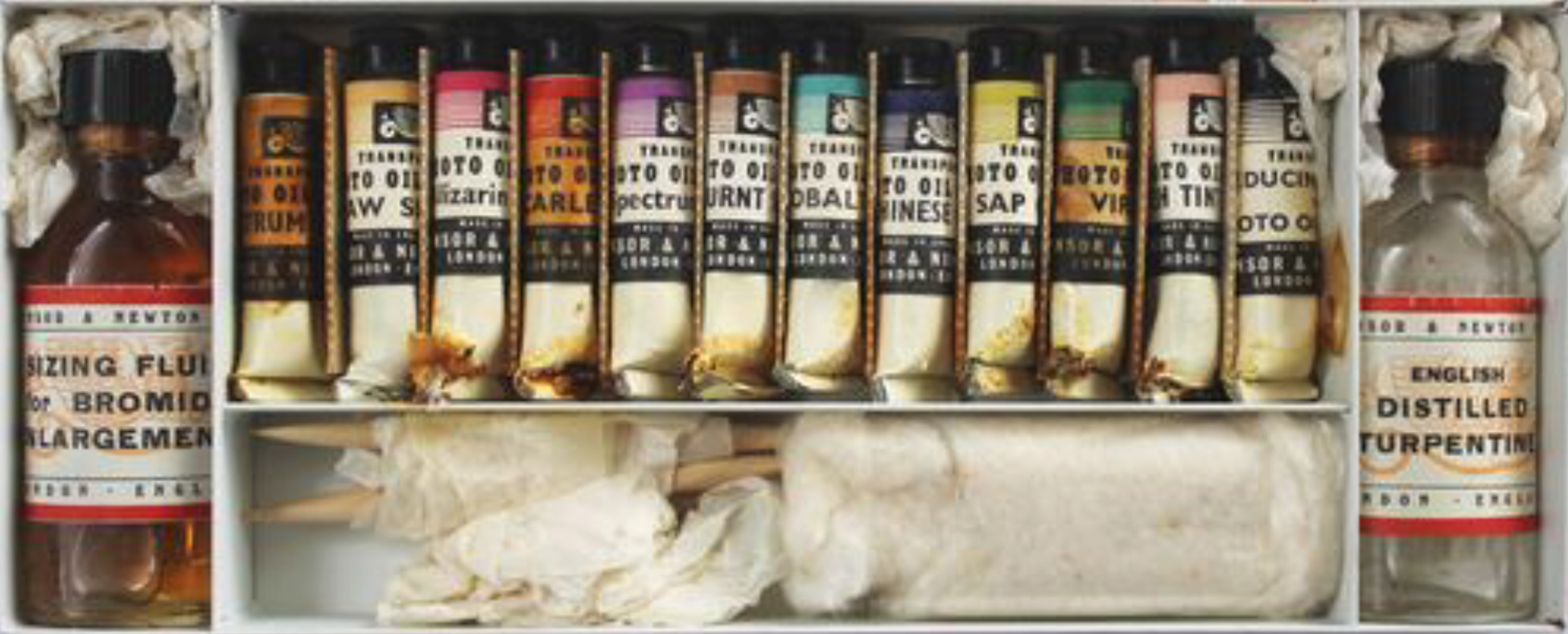
The colouring girls’ technique hardly used brushes, instead relying on cotton wool wrapped on the end of wooden handles. The pride in their work is really apparent in this terrific film of Grace Rawson, made by Loading Docs in 2016. Grace, long retired from Whites, was 83 when filmed, but clearly had lost none of her love of hand tinting.
Hand tinting or colouring of images has continued to this day in both printmaking and photography. It can now be achieved digitally, using apps like Photoshop to tint colour into monochrome images. If used sensitively this can produce remarkable results, as seen in the recent broadcasts of archive footage of WW1. Although these were movie film, the individual frames had been meticulously hand coloured. In addition sound had also been added, voices created from lip reading the original film. The effect is amazing, it seems to bring it to life in its full horror – no longer some distant and faded monochrome world.
There are photographers who currently use hand tinting, either for the effect or ‘look’ it gives, but some who still believe that it can still give a more accurate colour than all the technological equivalents. Kathy Vargas, from Texas creates composite hand coloured images which show the technique very well.
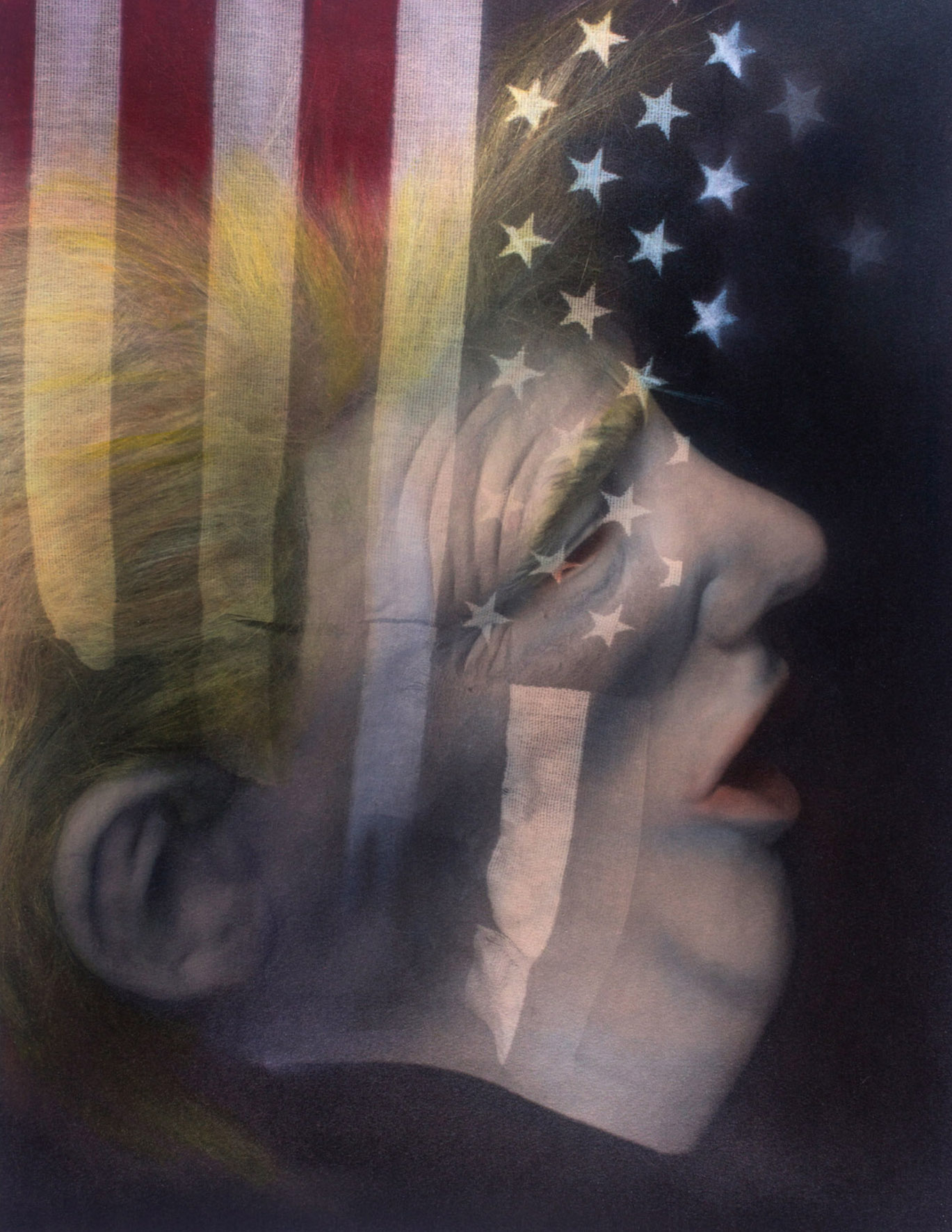
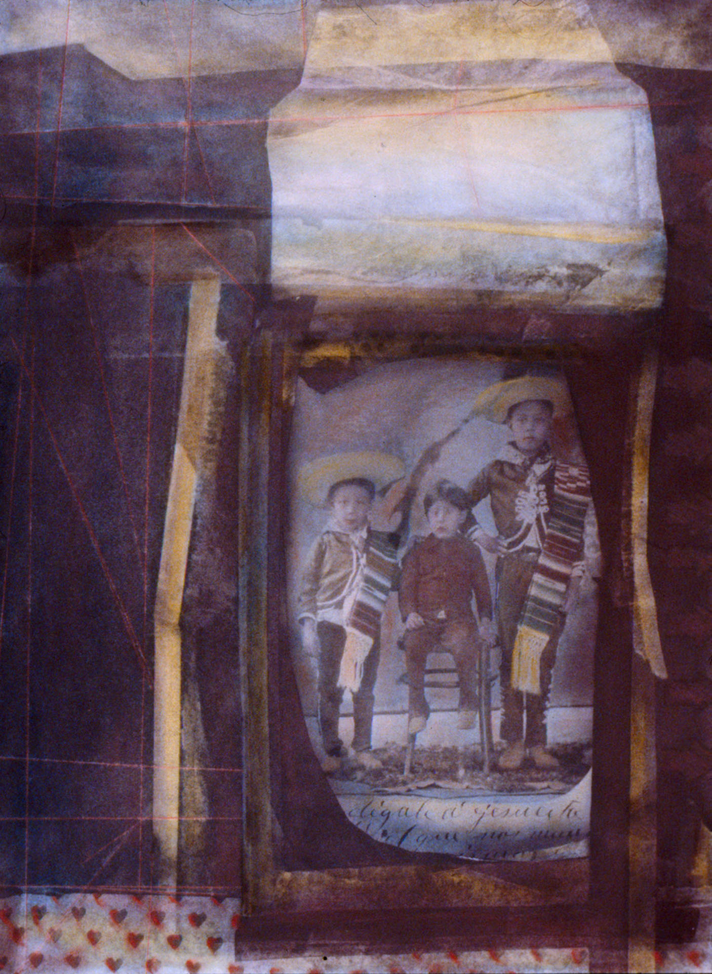
Kathy Vargas
One of the advantages of hand colouring, is that the colour can be added selectively, the entire image does not have to be coloured. Intensity of colour can also be varied easily. Off course it can be argued that all of this can be achieved in Photoshop, but as I said, it is all about the look that both can create. They are different.
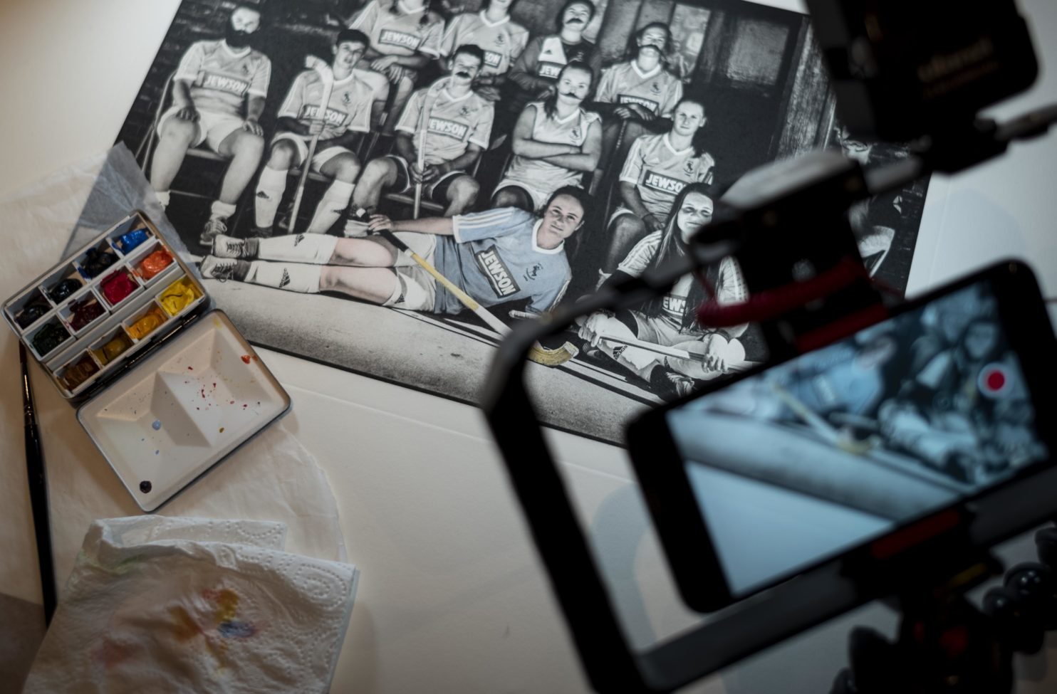
So, how to do it? Although I have focused (see what I did there) on photographers, the technique is identical whether on printmaking or photography. In this wee video, I am hand tinting a photogravure, printed from a polymer plate with oil based inks. The inks reject the water colour making it very forgiving. Hand colouring can be added to almost any form of printmaking, the principle is the same. The main thing to remember is that it is tinting, better to build up gradually than be heavy handed. My opinion is that if you can see brush strokes, it is clumsy and too much paint has been applied, or the mix and brush have been too dry. The exception to that might be with white. It is difficult to get opacity with watercolour, so gouache paint may be better for this. Paper is important too. Most high quality printmaking papers will be robust enough, especially the full cotton ones. In the video I am using Fabriano Artistico which is very good, as it is suitable for both printmaking and watercolour. Cheaper papers such as cartridge may be less forgiving and suffer surface break up with the watercolour. Unsized papers such as those from Japan are difficult in their raw state. They have no size, so it’s a bit like painting on to kitchen roll. The way round this is to manually size the papers, but that is a laborious task only for the truly committed. Or those prepared to boil and reduce a rabbit.
A good way to start is with scrap prints, you can practice plenty. As I said, an ideal technique for a lockdown.
John
Images of the colourists of Whites Aviation are taken from research by Peter Alsop. Peter is the author of the superb book: Hand-Coloured New Zealand – the Photographs of Whites Aviation. ISBN: 9780947503154

Comments 4
Very interesting John. I tried using watercolor pencils on a small photogravure of a dragonfly. I think it works better using “proper” watercolours using a fine brush. I’m tempted to try some more tinting as cymk photogravure seems like quite a pfaff and expensive having to use four plates.
Cheers Andy
Hi Andy, yes, my opinion would be to try watercolour paints. Give it a go. John
Hi John, good to read your blog and see some more profile for hand colouring. Can you kindly include a reference or acknowledgment for the Whites Aviation material you used? I am pleased my research is used but feel an acknowledgment for images etc is appropriate. Thank you for considering.
Hi Peter, great you saw the post, and thanks for your kind words. Apologies for not including an acknowledgement – that was an oversight. I have added one now. Thanks again, John